Or how data visualisation can save lives.
Too often a visualisations serve an arbitrary purpose. People like to add visualisations to applications for a variety of reasons: rich visuals can pretty up an otherwise boring page and make it more appealing to different audiences. As such, they are frequently used for less important things like convincing buyers as part of a sales process.
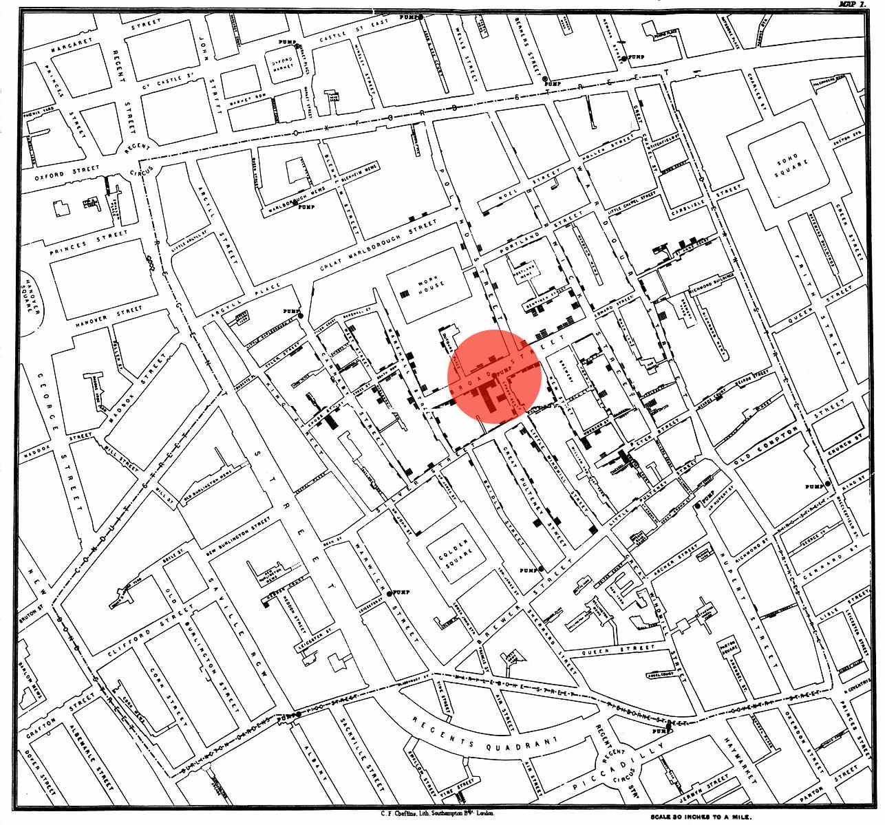
However visualisations are also a very important part of data analysis and epidemiology. The image above was created by John Snow. John Snow was a physician who arguably contained a 1854 London cholera outbreak. In 1854 the germ theory of disease was not developed and people attributed diseases like cholera to “bad air”. John Snow was not content at this explanation and created a map of cases of cholera. He then plotted them on a dot map as shown above.
His prognosis was that the cholera was caused by a nearby water pump (highlighted in red). He convinced the authorities to remove the handle of this pump which helped in curing the epidemic.